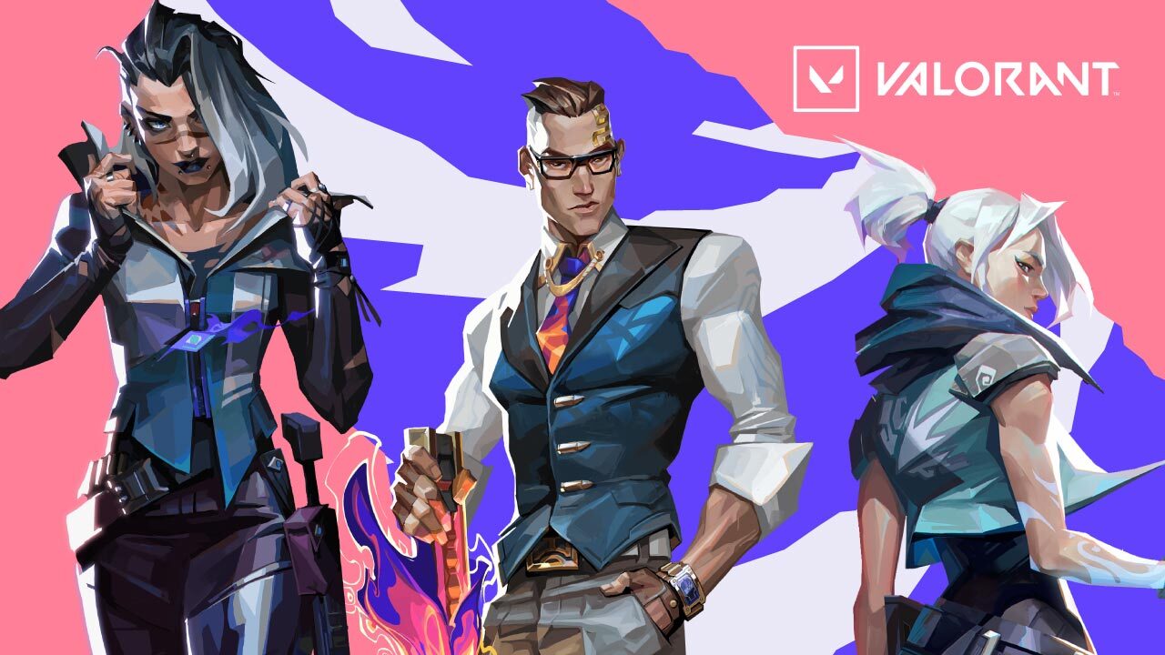
The 5.08 patch for VALORANT is now live, and it introduces a bunch of new features and changes to the game. The most notable change is the new UI upgrade, which gives the game a fresh new look, making it more stylistic and giving players a more modern appeal.
In addition to the UI upgrade, the 5.08 patch also introduces a new agent hailing from India’s coast, Harbor. He holds the power of the seas. Harbor unleashes fizzing rapids and crashing tides to shield his allies and pummel their enemies.
The 5.08 patch also brings a number of balance changes and bug fixes to the game. For a full list of changes, check out the patch notes here. Whether you’re a fan of the new changes, there’s no denying that 5.08 patch is a big one for VALORANT.
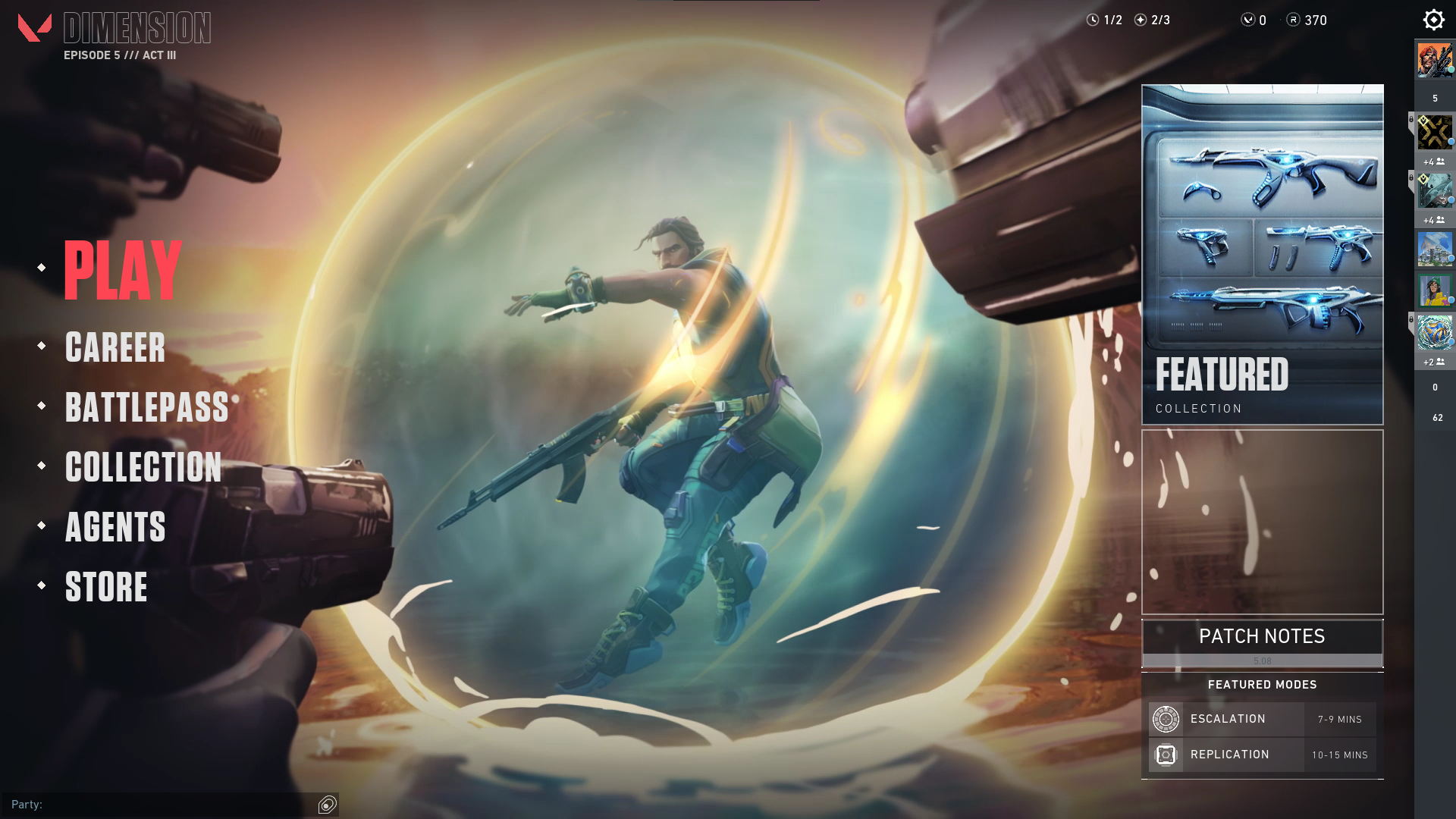
UI Changes
A.) Homepage Screen
According to Riot Games, “the new changes to the UI design is to improve legibility. To combine visually rich, vibrant, and fresh interfaces to unify our game and marketing visual identities. The homepage, in particular, is now very straightforward and easy to navigate”.
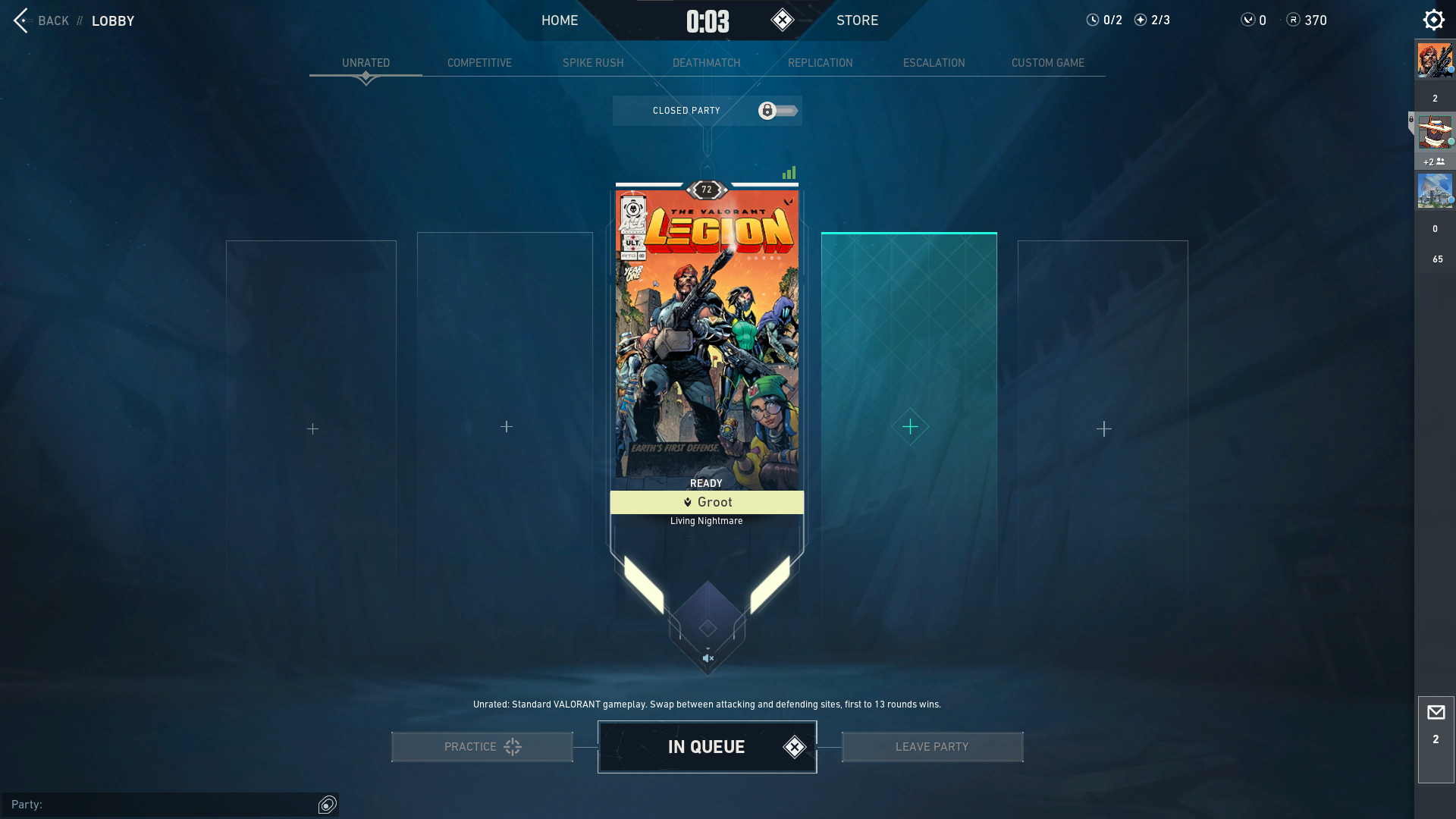
B.) New Lobby Screen
Oliver Zumstein, Visual Design Manager, said they removed a lot of visual clutter and improved the Lobby Screen’s overall readability to emphasize the player card and its representation and to give a clear ‘call to action. They also increased the screen’s contrast, pushed color values, and simplified the shape language.
C.) Screen displays
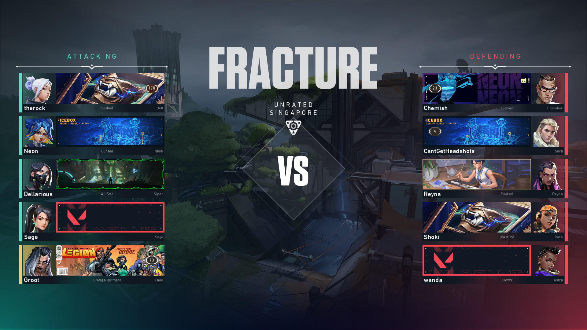
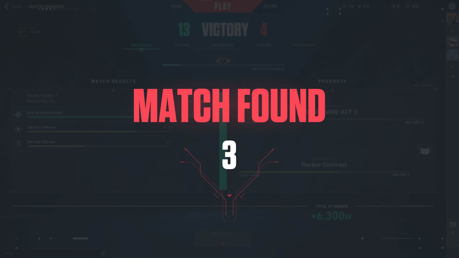
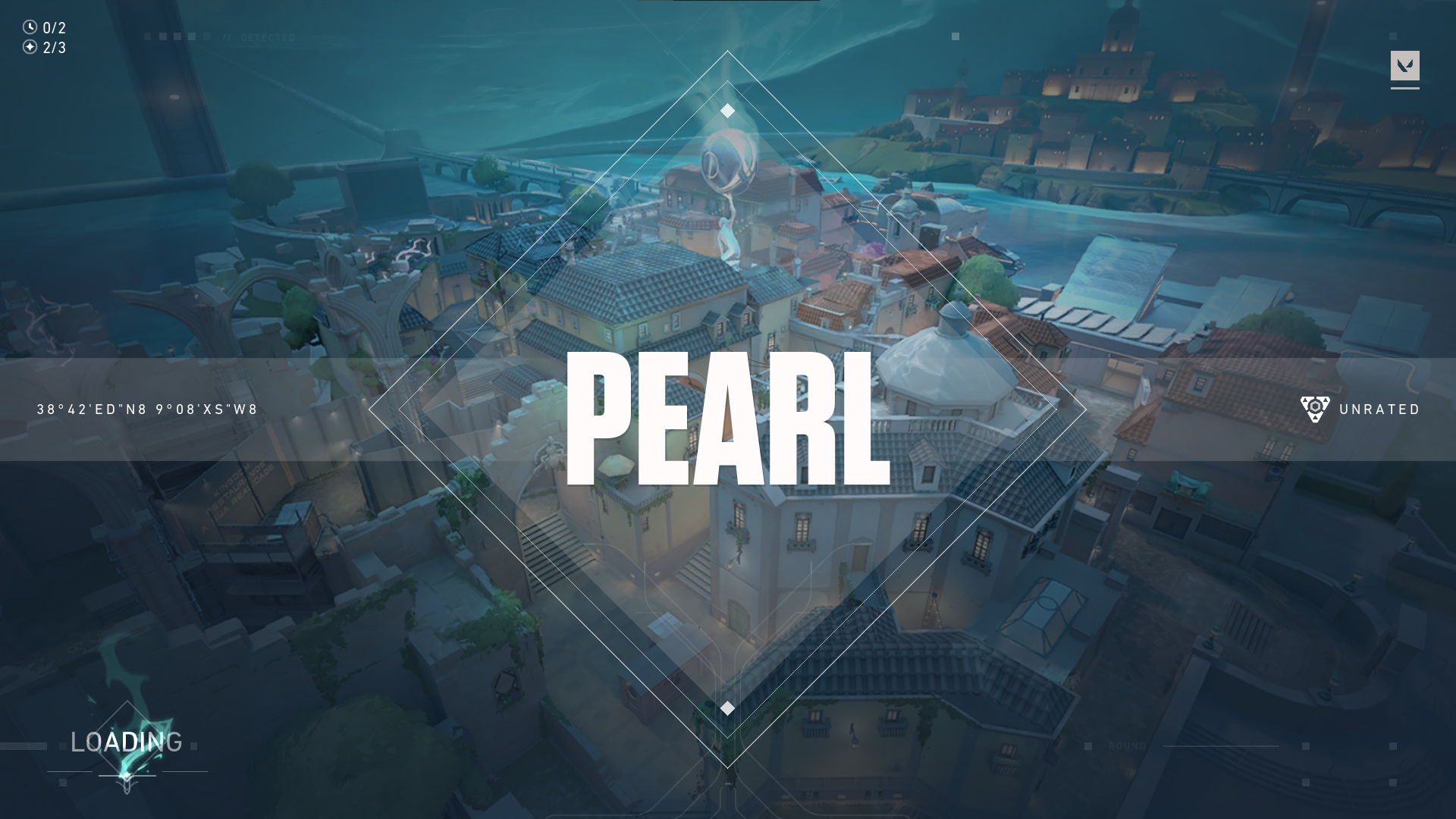
The new screen display brought the game’s intensity to a new level, including the Pre-match faceoff screen, loading screen, and Map screen. Max Smiley, Staff Engineer, said they want to highlight each team’s identity by making the Banners, Player Cards, Titles, and Rank badges pop up and stand out more, giving an overall more dramatic feel.
Pre-Match Faceoff Screen
Pre-match loading Screen
Pre-match Map Screen
Victory Screen
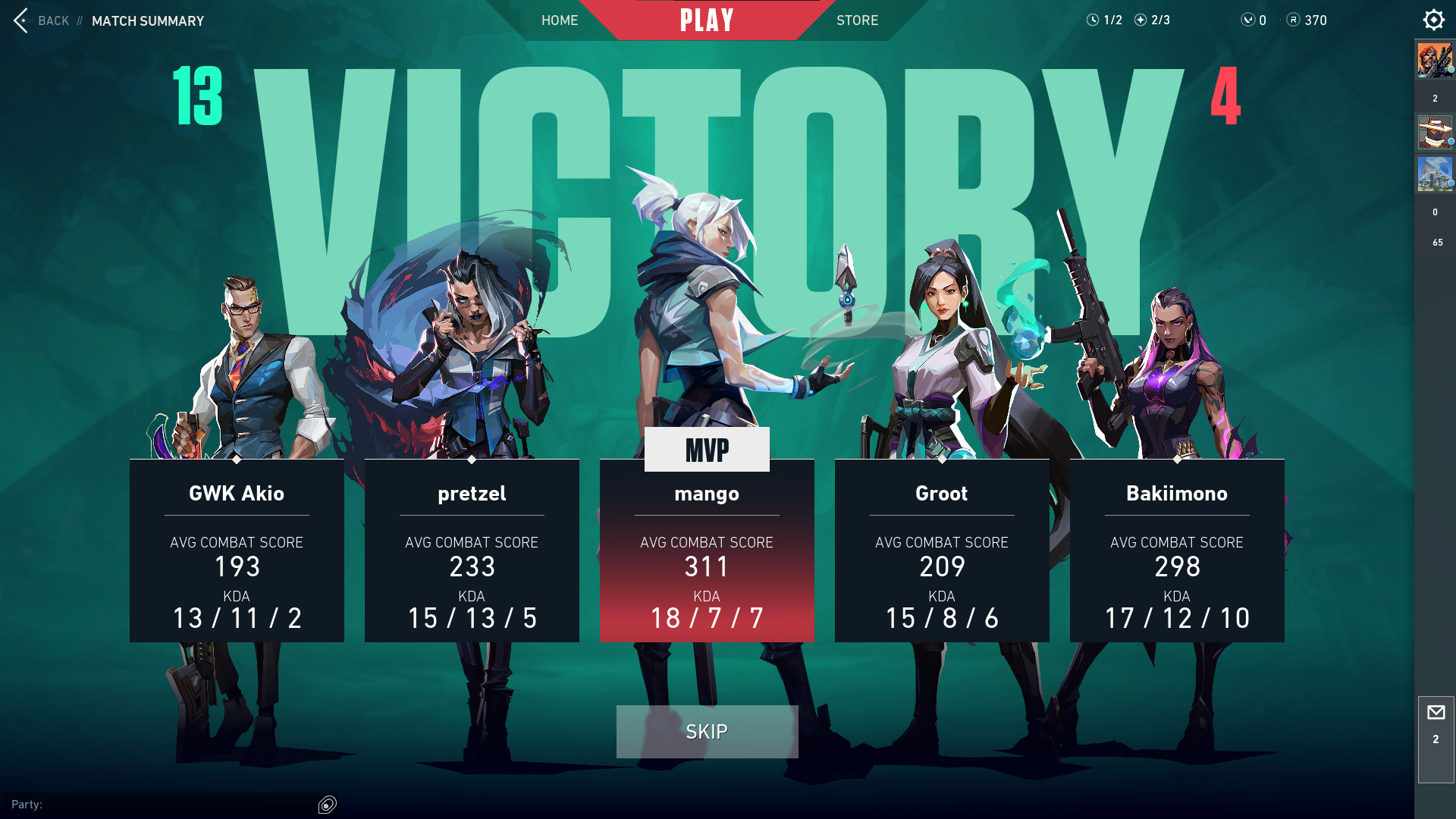
Who would not want to dominate every match upon seeing the new Victory Screen? The team scores and individual game results are clearly seen, providing a place of honor to the team’s MVP in the middle spot.
Defeat Screen
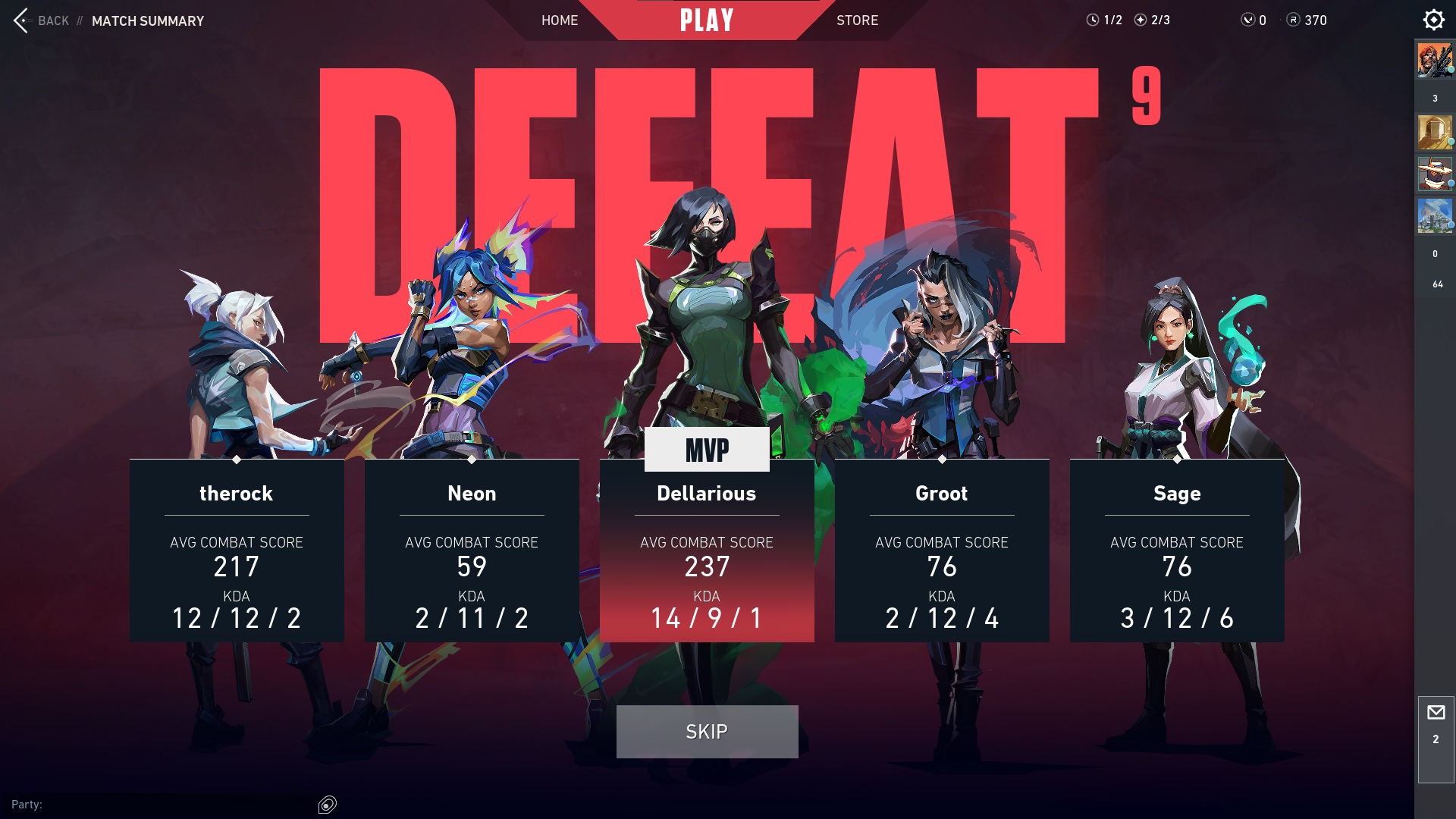
Even if the players’ team did not win the match, the new Defeat Screen gives a vengeance vibe that will boost the team’s will to fight again. The design is also the same as the Victory Screen. The only difference is the color scheme, which is red.
Other Fixes
a.) Agents
- Fixed an issue of area-damage abilities.
- Fixed Viper’s Toxic Screen bug.
b.) Gameplay Systems
- Fixed minimap bugs:
- Ally position indicators would still remain on the minimap’s edge even after the ally came back into view.
- “Recently Seen Enemy,” icon indicators sometimes update their position without the enemy being visible.
- KAY/O’s Suppression Blade position indicator appears twice on the minimap.
- Default keys opening the larger map during the round transition cause spawn barriers to appear as a single pixel.
c.) Map changes
- Pearl
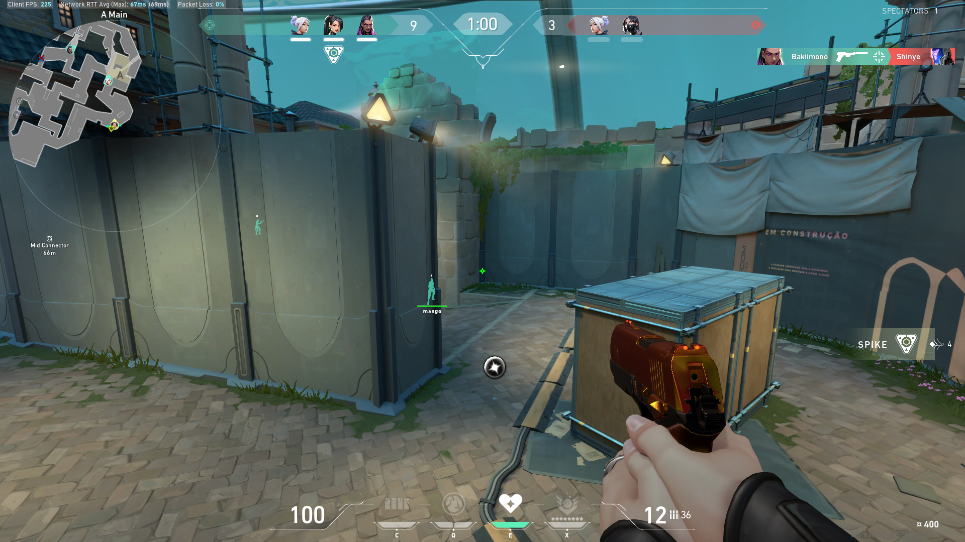
- Fixed a sliver line of sight from A Main to A Link.
c.) New Agent
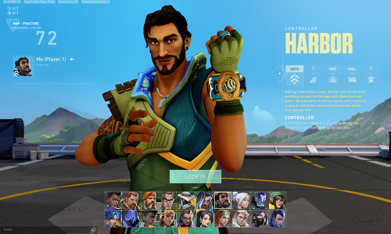
Riot Games has just released their latest agent in VALORANT, and he is sure to make a splash! His name is Harbor, and he is a support character whose abilities are all geared toward helping his teammates and giving them an edge in battle.
Please click here to check our full Harbor guide.
Don’t forget to top up your VALORANT Points to try Harbor out in an actual match in the new gaming experience or purchase the new Battle Pass (or both). Just enter your Riot ID, select the value of Points you wish to purchase, complete the payment, and the Points will be added immediately to your VALORANT account.
